The Brief

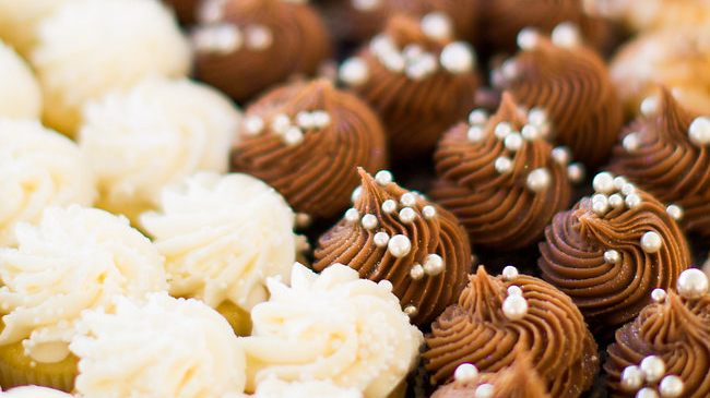
Near the Inwood Village in Dallas, Texas sits an amazing bakery that is the top destination for all things delicious. Oh, and they’re also under new management. Previously, their owners had a whimsical bakery and gift shop with vibrant pastel colors. Tart is known for its custom-made cakes and their French macarons.

Their whimsical brand didn’t match the clientele of the Park Cities area. The bakery’s storefront gift shop didn’t draw the foot traffic they desired and diluted the brand. 

It is time for a change.

It has to look as good as it tastes!

After meeting with the owner and interviewing the staff, it was clear that everyone was very passionate about one thing, everything they do has to taste as good as it looks. That ended up being the strategy for the rebrand of their bakery. The design had to look as good as it tastes.

I started with some research of the area to identify the typical client persona. Trendy and stylish with a touch of feminism. The colors needed to be bold and simple. We kept one of the colors from the previous palette; however, we shifted it from pastel pink to a richer pink. Black accompanies the pink to add to the elegance and balance the more feminine color. Then I developed a comprehensive set of brand and message guidelines. This helped Tart Bakery create consistency as they develop menus and promote themselves on social media.

An easy to use online experience.

As I thought through the online experience, I decided to create a focused landing page. We eat with our eyes, not our mouth. That meant that photography had to be the key element to showing off the bakery’s masterpieces. This approach allows the user to get right to the menu, find what they want and place an order.

Here’s how I turned the whimsical to sophisticated.

Want to build something great? GET IN TOUCH