Avetta

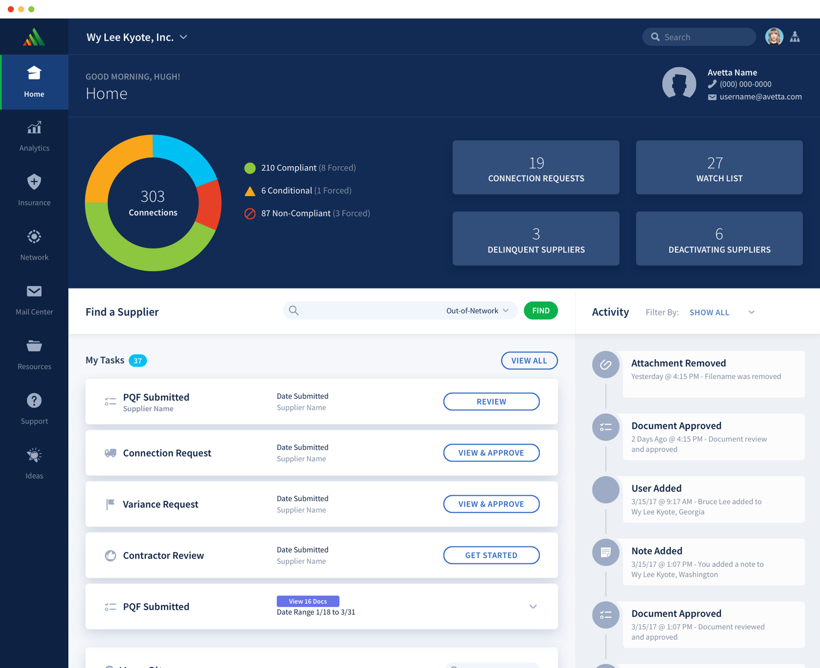
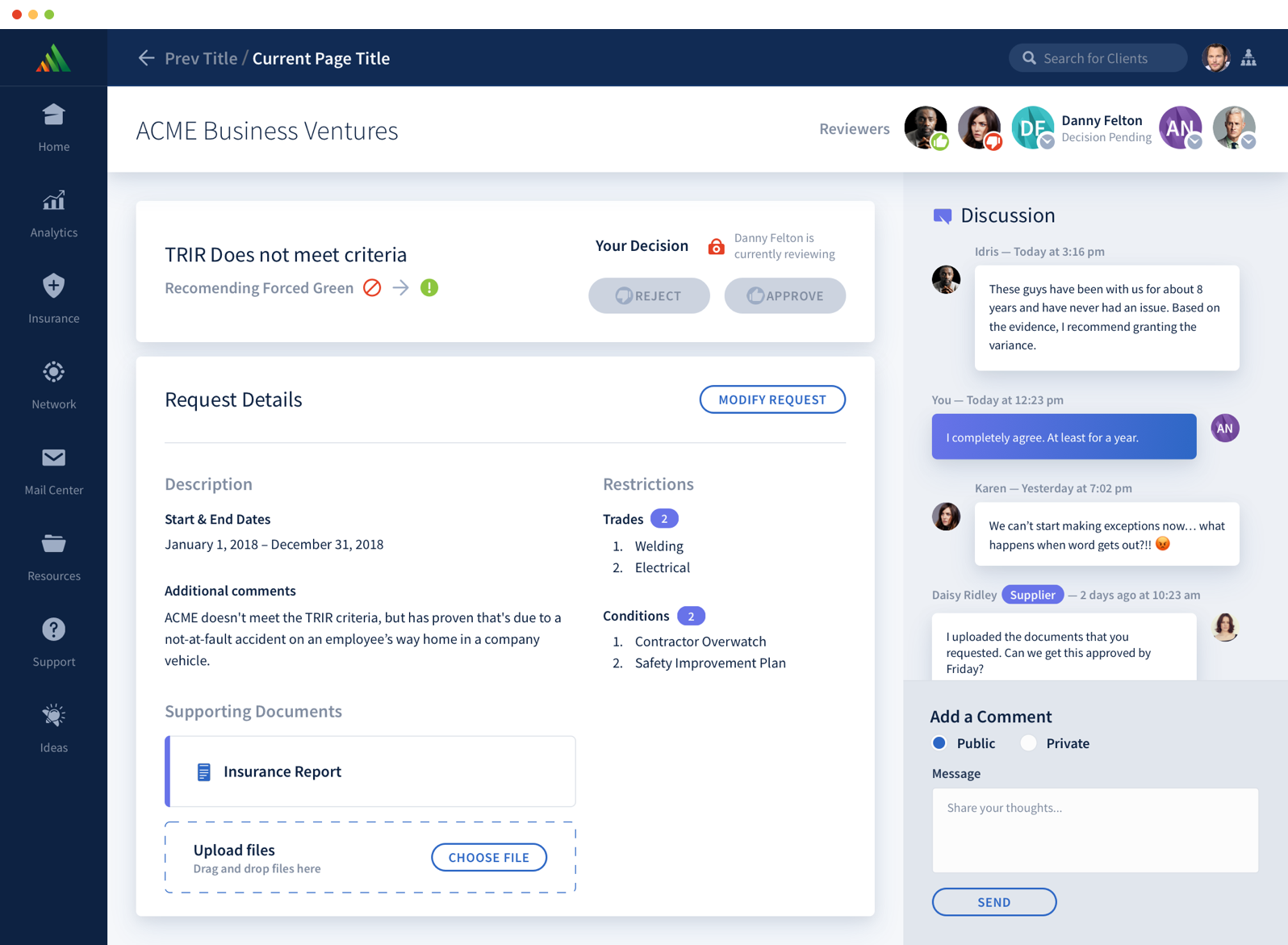
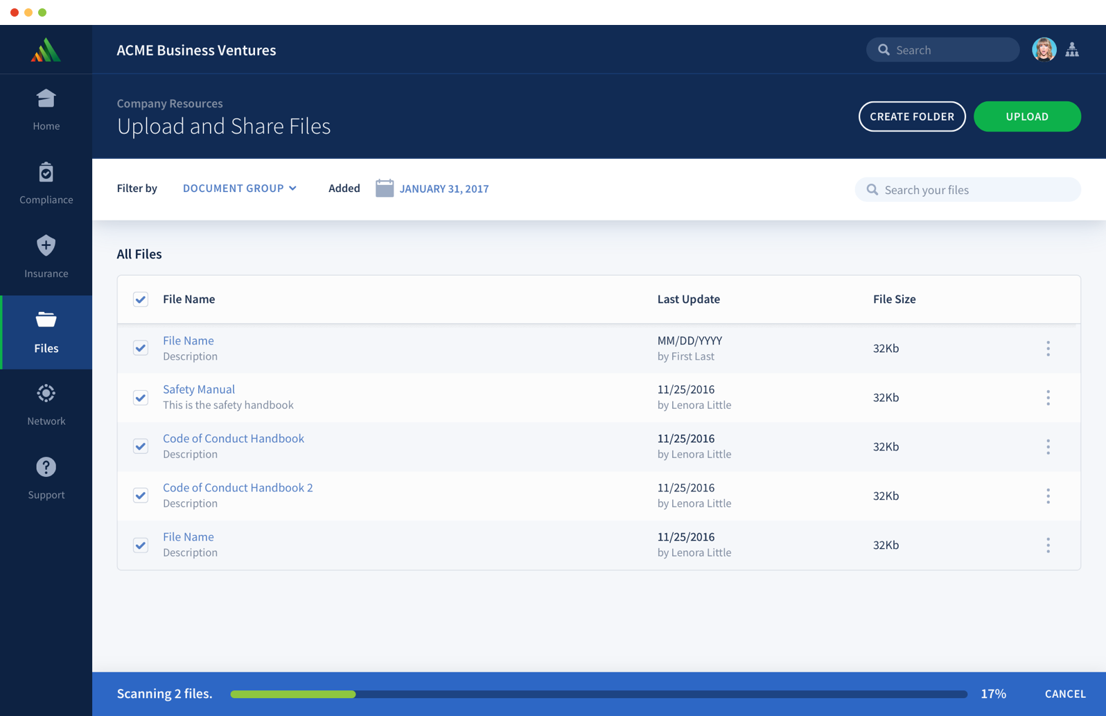
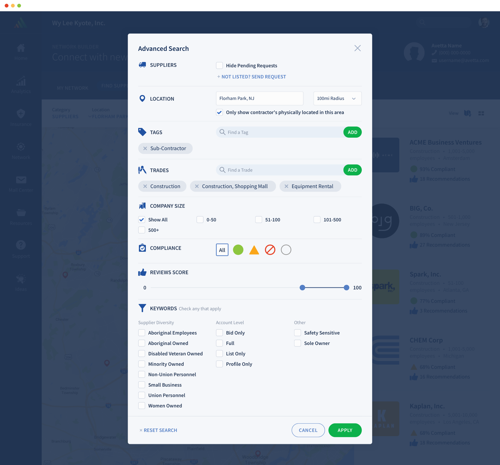
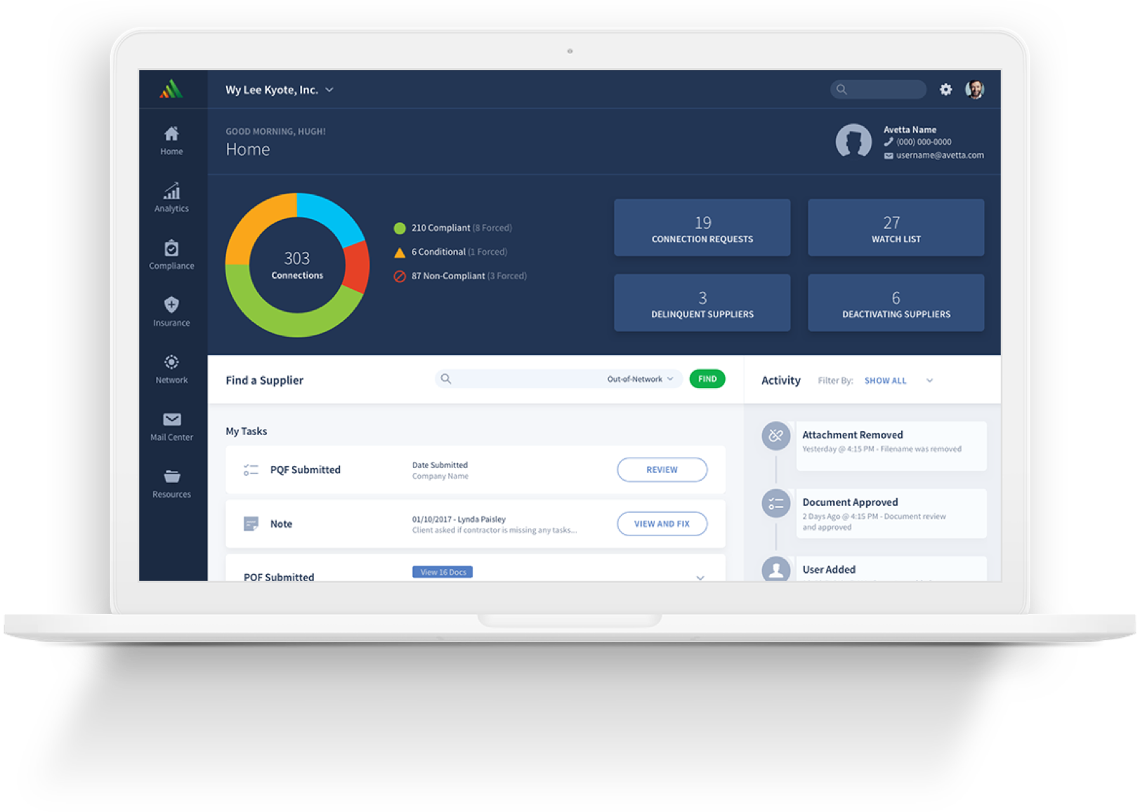
Avetta’s supply chain risk management software connects the world’s leading organizations with over 65,000 qualified suppliers, contractors, and vendors in over 100 countries. In preparation to launch their new platform, our challenge was to create the new version of their toolset – a merger of several products with new improvements. At the core of this new product was the need for a cohesive design structure to guide the product design and development process.


The Challenge

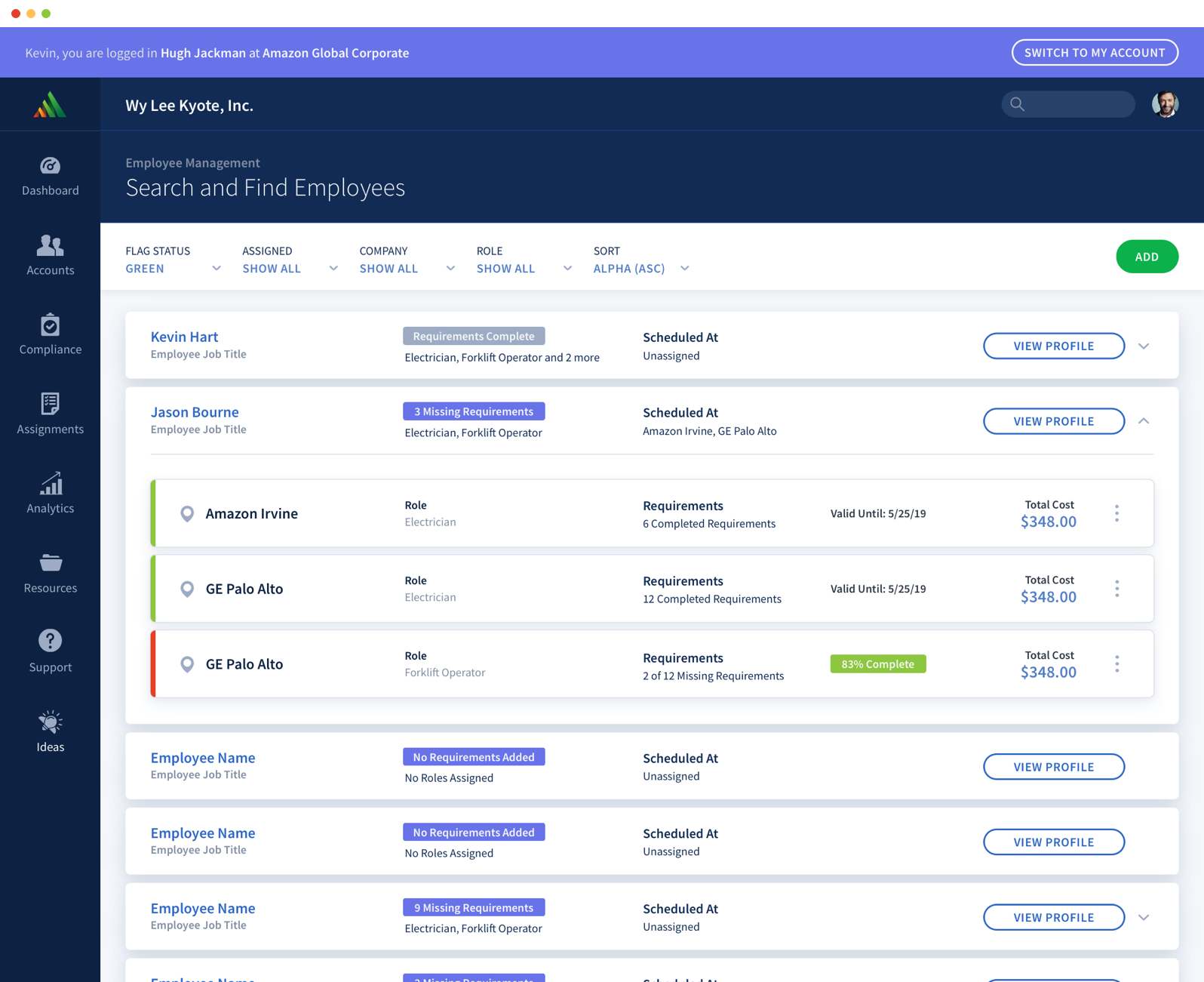
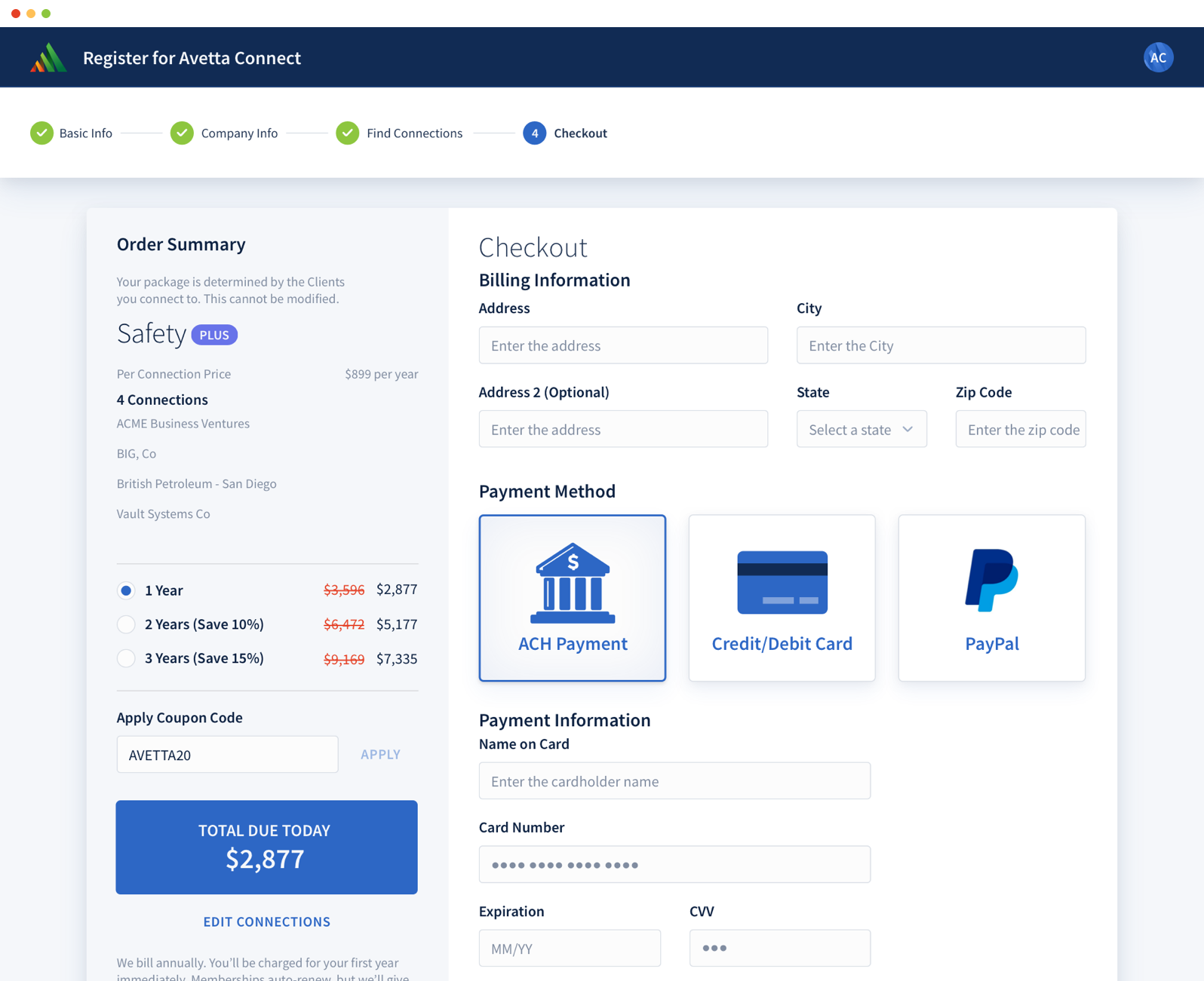
Avetta never had a design system with their previous platform. The older platforms weren’t responsive or mobile friendly. Our challenge was to create a branded app design that was scalable (both responsive and having the ability to grow with new product offerings) with workflows that were clear and concise.


The Approach

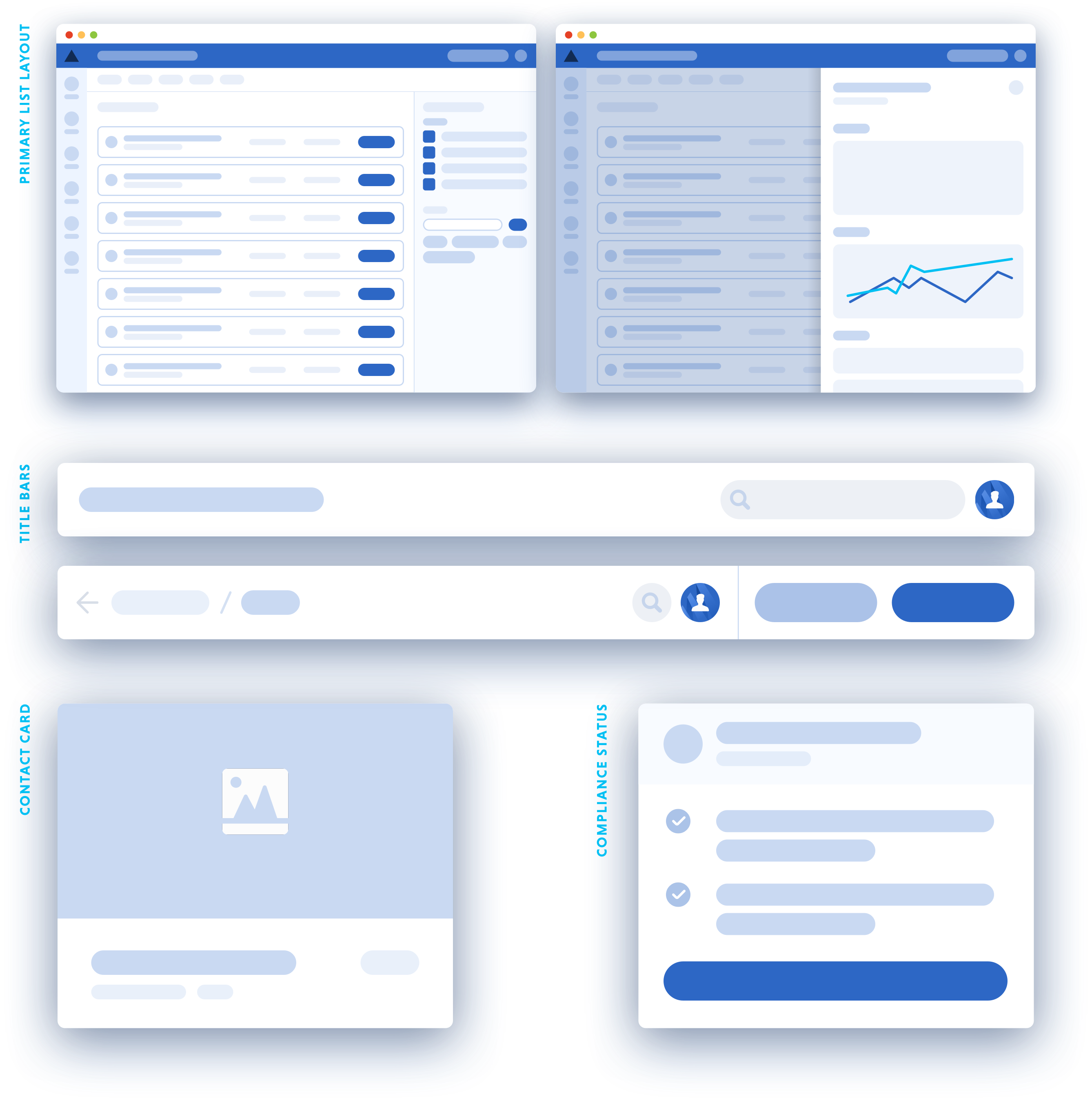
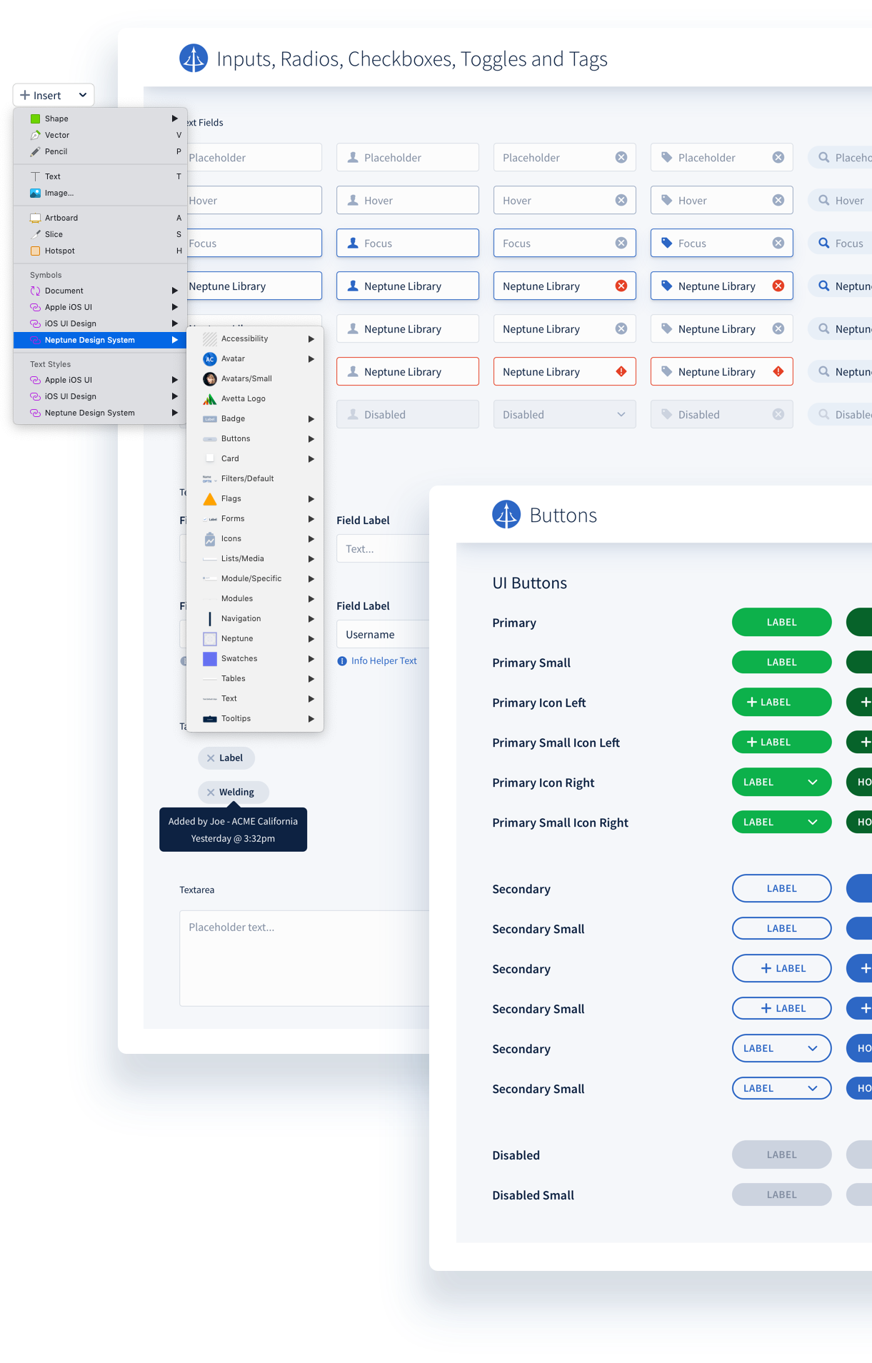
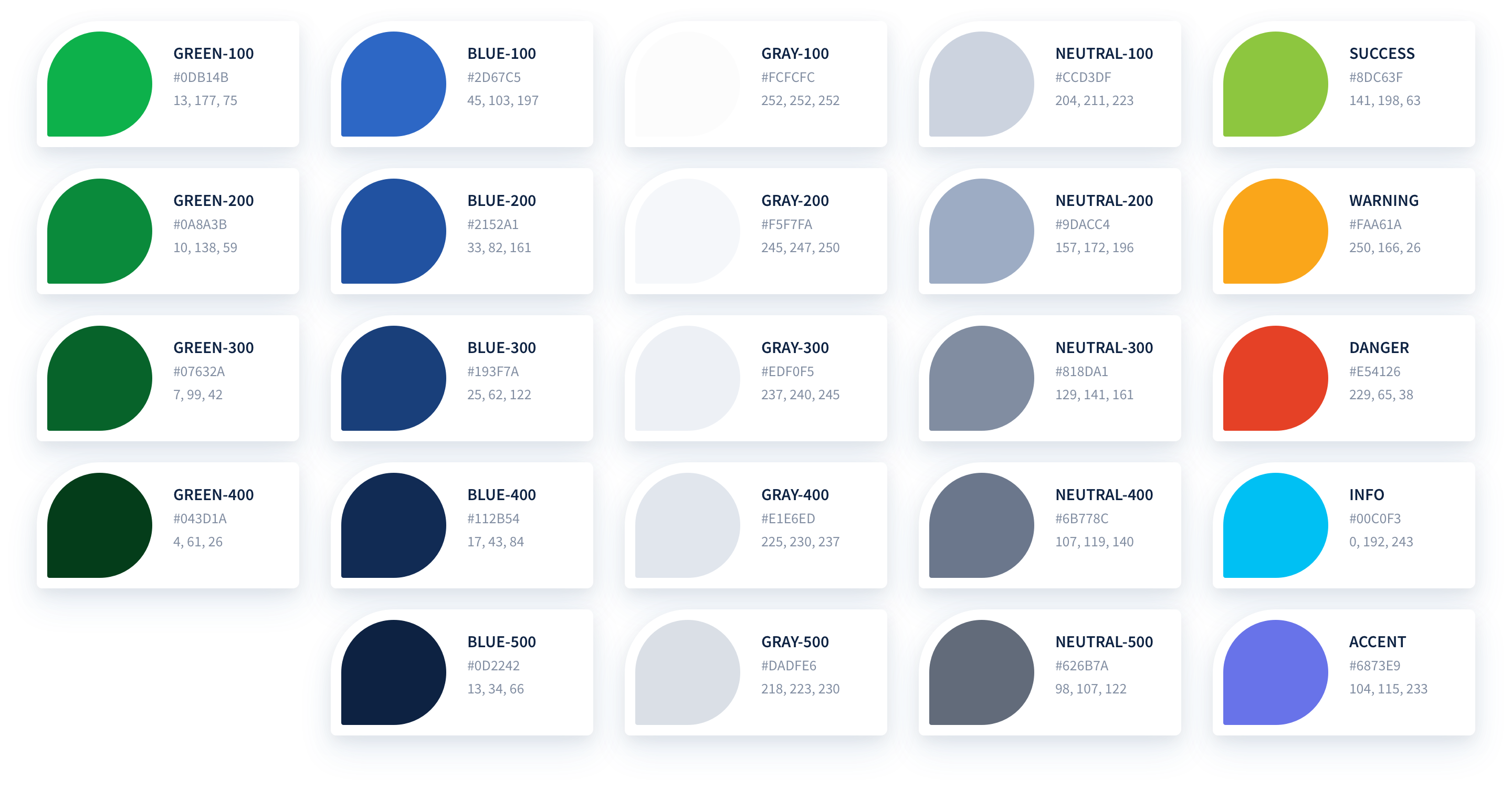
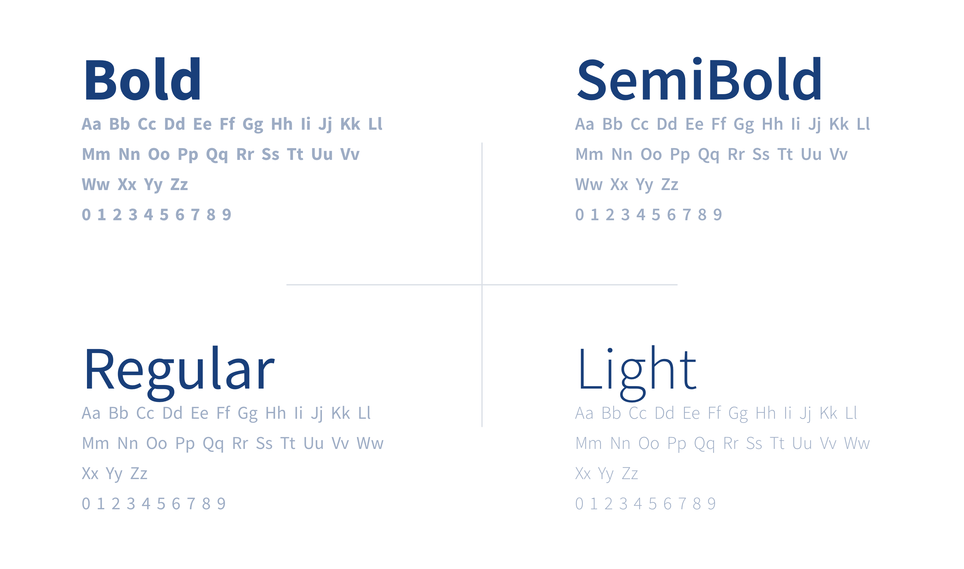
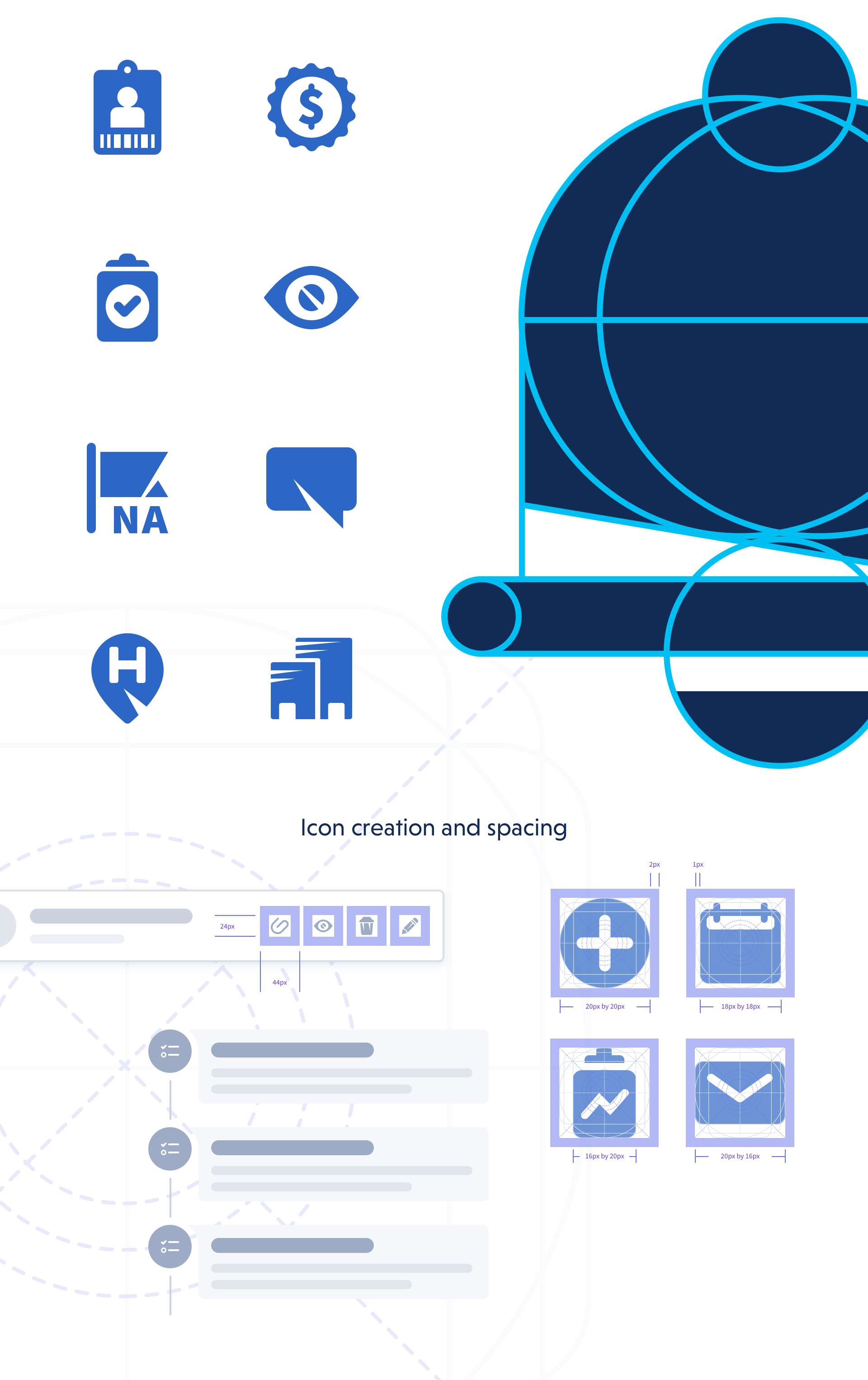
With the help of my colleague, David Hübler, we spent almost 5 months creating a design system using the Atomic Design methodology. To start, we researched many of the existing design systems that are out there today. Our favorites are Atlassian, Carbon, and Polaris. We even reviewed the ever popular Bootstrap and Foundation frameworks. It gave us perspective on how to structure our products and build for the future. We used our research to sketch, design, iterate, iterate some more, and built functional prototypes of all the building blocks needed to create the new app interface.


The Result

Our newly formed, end-to-end design system needed a name. We call it NEPTUNE. With Neptune, we now have a system to guide our design and development teams. Our development partners have a structure, with documentation, for implementing components – not to mention, create consistency while building features faster.

Guided by strategic goals

Remove guesswork

There is no greater frustration than to have to guess about how to use a product. In every area of our designs, remove the need to guess what a thing does, or what the result of completing a task might be. Err on the side of over verbosity. Be straightforward and help users feel intelligent. Avoid the use of meaningless icons.

Open it up

Strive for low contrast and add shadows for depth. Maintain singularity in focus with task cards, but encourage generous use of whitespace using the 8pt grid. Favor strong typographic hierarchy over borders and lines.

Draw focus

Use color — as a way to draw a user’s attention to the important elements on a page. Be intelligent about how to focus the user on things that need their attention. Remove unnecessary colors that distract from the primary task.

Be transparent

Expose important details by default. Don’t hide actions from users. Maintain a clean interface, and prevent mis-clicks or aimless wandering. User can decide what’s ancillary over what’s primary. Keep the interface clean, but not at the sake of confusion.

Less, but better

Less, but better. Remove elements that don’t serve a clear function. Prefer streamlined workflows and fewer clicks over complex wizards.

Rapid prototyping

Create a component framework using React for easy prototyping capabilities to test micro interaction patterns.

Scalable component library

Sketch your ideas on paper, then design the full interface, regardless of device type, using the Sketch library. Nested symbols are used to create standard Molecules and Symbols to allow full control over any parameter of the layer.

01 Color

Neptune creates a visual impact that sets our brand apart from the rest. Strong hierarchies, relationships between like elements, and status changes are at the core of this palette’s structure.

02 Typography

Text is the primary method for users to digest content and accomplish work. Thus, it needed a solid structure to clearly separate information. We utilized a normalized (rounded to the nearest whole pixel) Major Second type scale to establish a clear visual hierarchy and legibility.

Font Weights

Our main corporate font is Source Sans Pro, and it comes with 6 font weights. That’s too many options for users to differentiate content in the design hierarchy. We limited our weights to 3: Light, Regular, and Semi-Bold. We reserve the Bold weight for specialty items.

Typography Scale: A normalized Major Second

03 Iconography

We wanted icons to provide visual support and help convey what verbal language cannot. As a general rule, the more icons you use, the less attention they draw. We use icons sparingly, yet strategically – to provide clarity and reduce cognitive load on the user. Every icon was designed using a common grid (something you’d see with Material Icons), with special consideration for placement, sizing, and white space.

04 Interface Guidelines

Neptune’s core layout principle is, “Let it breathe!” A clean layout removes the guesswork for users, and opens up mental space to get into a flow. Layouts contain carefully placed individual parts in relationship to the whole, and it holds them firmly in space while supporting consistency across the application. Each Module was created to group related content together, organized in a manner that highlights the most important information first, to make it easier for users to work with. Ultimately, creating familiarity for the user.

05 The Design System in Action

Want to build something great? GET IN TOUCH